Atsumi
Brand Strategy + Experiential Branding
A salon built from identity to interiors.
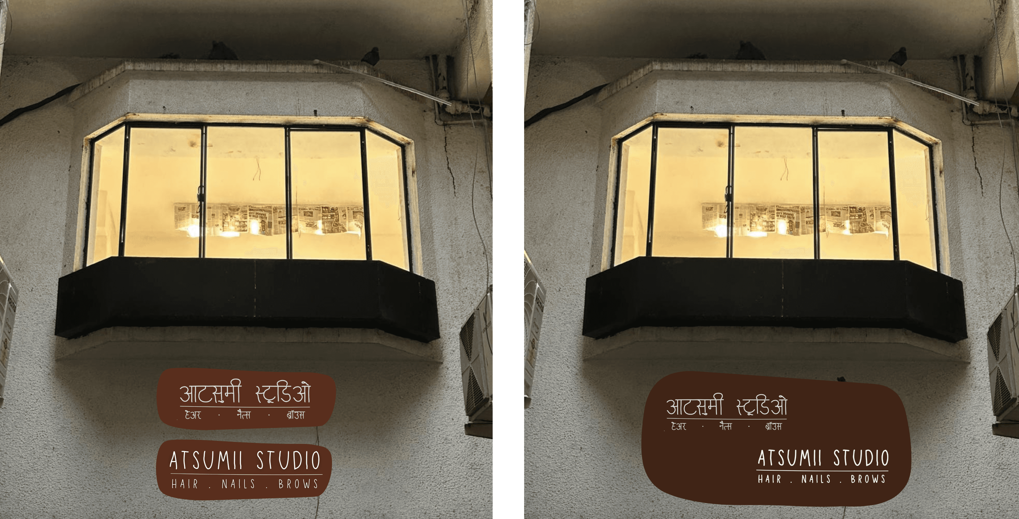
Atsumii Studio is a hair, nails, and brows studio by Neha Khatanhar. We built the brand from scratch, logo, colour palette, typography, and then designed the space it would live in, so the identity and the interior speak the same language.
(Research)
The colour palette was drawn from skin, hair, and natural texture rather than trend. We studied how beauty spaces tend to default to clinical or overly feminine, and positioned Atsumii somewhere warmer, grounded in earthy tones, organic shapes, and materials that feel closer to home than to a salon chain.
(Experiment)
We developed the logo in both Hindi and English using Louisville 1 as the primary typeface, and created a set of organic logo shapes that work across signage, social, and interiors. The interior design followed the same palette, linen curtains, stone basins, brass fixtures, rattan furniture, colour-blocked walls, with every material selected to extend the brand identity into the physical space.
(Results)
A complete brand identity system and interior design proposal. Logo, typeface, colour palette, social media templates, signage specifications, floor plan, furniture direction, material selection, and plant screening, all delivered as one connected body of work.